

Choreography Project
Branding | Logo Design

Photos Courtesy of Choreography Project
Choreography Project is the passion project of two dancers based in Providence, Rhode Island, Kristy DuBois and Eugenia Zinovieva. Based in connecting underprivileged dancers, this association wanted a brand that represented their goal of inclusivity.
Know-How
Logo Design Branding Apparel Design
Client
Rhode Island Choreography Project
Year 2024
Programs
Adobe Illustrator Procreate
Introduction
I met this project through a professor, Beth Carey who was connected to Kristy DuBois and was asked if she knew any students who would be able to take on a summer project focused in a design rebrand. Thankfully, I was who came to mind. This was entirely remote and a task of guiding artists who had ideas of what they wanted their brand to look like in the end, without knowing how to get there. Much of my job felt like a translation between someone else’s brain and making their thoughts come to life in all aspects.
The Ask
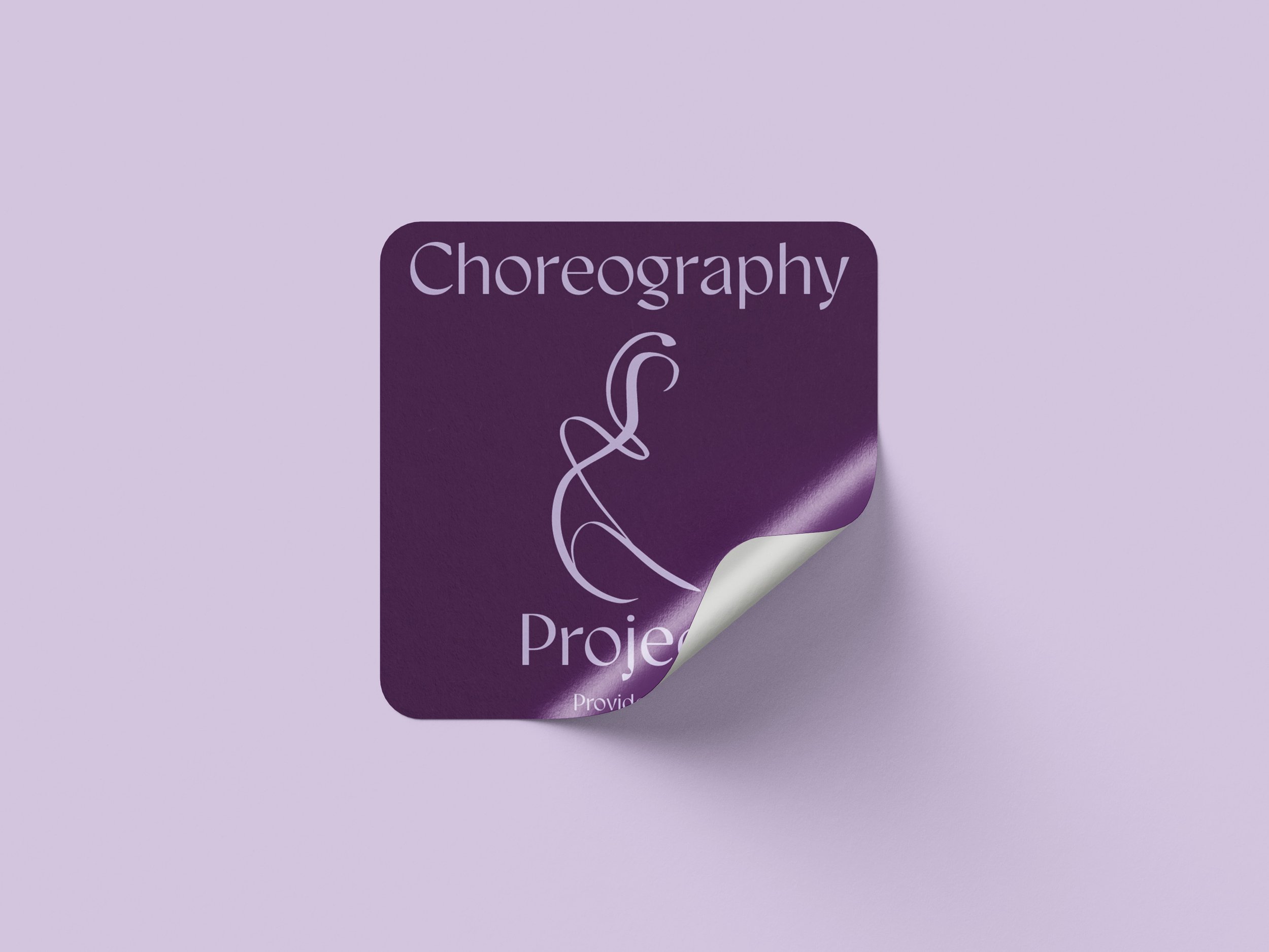
The primary need for this rebrand was a new logo and an established color palette. The directors knew what they wanted it to feel like, but weren’t sure how to make their brand look that way. Alongside their rebrand this team was also looking for a t-shirt design and stickers to provide to participants in their showcase, Here and Now, that acted as an opening to their new identity.


The Process
Early Research
This team’s primary goal with a rebrand was to communicate more inclusivity. Until late 2024, this was the Rhode Island Women’s Choreography Association. What the directors found with this was it posed an issue in the dance world that has leaned into inclusivity for decades. With that said, this team did not want to completely abandon their roots in women’s history.
Figuring it out
With this company history and baseline established, it was time to work on remotely meeting in the same spot with what we both saw this brand being. We went through a few color palettes with very minute differences. When it came to their logo, they wanted to do something far from standard dance studio ideas. I found the dance world loves a silhouette logo, but this was not the direction this team wanted to go. Through email and zoom calls, we went through dozens of ideas to find exactly what would work for them.
Nailing the idea
After full exploration into many options on all fronts, we had a color palette and logo. With history and color theory considered, we landed on a royal purple, a light lavender, and a dusty blue to represent this brand. On the logo front, abstract was our friend. They wanted a symbol to represent how fluid the movement of dance can be, without a gender being at the forefront. Using a form from photos provided, I drew a generalized figure with a contrasting brush. The varying weight of the stroke is intentional, to provide a static representation of movement. As a final piece to our puzzle, the typeface Gyst Variable was selected to match the varying stroke width of our symbol.
The Result
With finalizing our baseline, I was excited for the opportunity to put these decisions into motion right away. I was provided with recent photoshoots of the choreographers to establish which photos would work best with the logo for stickers. For the t-shirt design the request was to make a sub-logo for the show itself, and include the standard inclusion of all names involved, but categorized to their roles.